Table of Contents
Introduction
When I initially saw the phrase “Colour Theory”, for a pedantic like me, it is an odd phrase because colour is an absolute, it just is one thing. However, a scratch below the surface and it is really about the use of the colour.
There is lot of stuff out there but I guess the first place is Wikipedia. I’ve just tried to summarise this page:
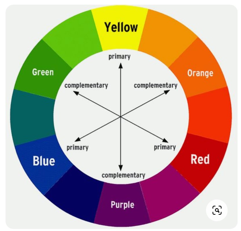
- You have a colour wheel that splits the colours into primary, secondary and tertiary.
- By using the colour wheel, you can then group colours to achieve certain classifications such as warm colours, cold colours, complementary, analogous, etc.
- Using this helps you set a colour palette for your painting for example I’ve chosen blue and orange for this site which are considered complimentary colours as they on opposite sides of the wheel.
Key terms
There are quite a few terms that are bandied about. I’ve tried to isolate some of the main one in the table below:
| Term | Description |
|---|---|
| Primary | The reason why they are primary is because you cant get those colours from mixing. Red, Yellow, Blue (do not confuse this with Red, Green and Blue which is slightly different) |
| Secondary | Orange, Green, Violet/Purple - these are from mixing primary colours |
| Tertiary | From mixing secondary and primary : Red-Orange, Yellow-Orange, Yellow-Green, Blue-Green, Blue-Violet, Red-Violet |
| Warm | Red through to Green |
| Cool | Green through to Red |
| Complimentary | On opposite sides of the colour wheel (2 colours) |
I have a colour wheel (see tip below) that also includes other classifications of groupings on the wheel: Analogous, Split Complimentary, Triad and Tetrad. Wikipedia also has a number of other classifications.
Personally, I am less interested in the nomenclature than understanding colours and using colours that work together. For me, knowing what is primary, secondary and tertiary plus knowing what is warm and cool, at this stage is probably enough. When I chose the colours for this website, I chose them because I like blue and orange, and it was only afterwards that I found that they are classified as “complimentary colours”. I didn’t even think about the colour psychology (see below)!
Tip
Printing out a colour wheel and putting it up on a wall is actually super helpful. I bought mine from Etsy.
Video
I personally found this video the best as it is short and concise but it from the design world rather than drawing world:
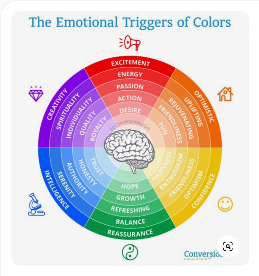
Colour psychology
In general, some colours have an emotion or portray certain ideas better than others. For example, people associate green with nature, red with fire. The following are websites that breakdown the colour into a group of emotions and ideas. Again, this type of colour psychology is for designers and do not know if it is applied to illustrations or art.
A good image to portray the different ideas attached to each colour is useful and there plenty available: just google “colour psychology”.
Here is an example from Pinterest:
Colour Palette
A colour palette is just a set selected colours that are used for the drawing. For designers, having a colour palette and understanding colour psychology super important. Also it seems for illustrators, this seems to be a thing as well and some seem to work from a preferred palette. I don’t know if traditional medium artists also have this approach because I’ve simply not spent any time asnwering that question.
For designers, having a colour palette and understanding colour psychology super important. Also it seems for illustrators, this seems to be a thing as well and some seem to work from a preferred palette. I don’t know if traditional medium artists also have this approach as I’ve just not spent a lot of time on it.
There are a host of websites that can generate colour palettes for you. The following are simply the ones that I’ve had a look at (not actually used any of the palettes though).
The good thing about these sorts of websites is that they massively expand the types of classification from “warm/cool”.

I just like this because it shows a sample website as you go through the various palettes.


Also online, you’ll see a lot of youtubers using Adobe Color as well but I’ve not used it at all and only including for completeness and at some point I will explore it!
Just the first step
The above is just the very basics but one suspects that there will be a lot more to learn for colour for each medium – water colour, pastels, etc – and against the different types of paper and canvas. As each of these are appraoched, then this page will be updated or added to.
June 2022