Source for image: https://www.pinterest.co.uk/pin/319263061064518833/
Introduction
Colour in digital drawing builds on the traditional colour and basically adds another layer of complication for digital drawing.
There are additional elements that need to be considered and the really hard part has been how to filter the sheer volume of information and work out what is important at this stage!
By way of background, I’ve only used three programmes in total – Sketchbook Pro Inkscape and Gimp. Inkscape and Gimp were overwhelmingly difficult to understand and use for a newbie. I still use Inkscape these days to do very basic stuff (for example musmus.com logo is based on a font in Inkscape). So everything I’ve tried to glean is based on those two programmes.
One key principle : Let there be light.
Light on a computer screen is the equivalent of white paint from traditional paint mediums. A computer will add or subtract light to make things lighter or darker.
Terminology
There are a number terms and acronyms used and these are set out below in the table.
| Term | Comment |
|---|---|
| RGB | Red Green Blue: these are additive colours and the core colours for digital drawing |
| CMYK | Cyan Magenta Yellow Key (Black): these are subtractive colours and what you need for printing |
| HSV | Hue Saturation Value: the three variablea for colours |
| HSL | Hue Saturation Light: |
| Hue | The primary, secondary and tertiary colours |
| Saturation | The strength of the colour |
| Value | The amount of black or white |
| Light | Light is not quite the same as value as it is the equivalent of light shining on a colour rather than a colour getting lighter |
| Opacity | How much any colour underneath will be permitted to come through the top layer |
| Additive | How the RGB colours are mixed by mixing the primary colours starting from black to white (white light is made up of all colours) |
| Subtractive | How the CMYK colours are mixed and goes the other way from white to black. This is for printing. |
Source for defining additive and subtractive: https://pavilion.dinfos.edu/Article/Article/2355687/additive-subtractive-color-models/
Firstly, to narrow the above table down.
It seems additive and subtractive are really do to with classifying the colour models (RGB, CMYK) and which are used for print and digital and that is all you need to know ie one is for digital and other for print. Therefore, given that I am only doing things digitally I am going to ignore this.
HSL and HSV seem to be almost similar enough for me to ignore the difference between the two until I reach such a time when it becomes an issue (also see here if curious).
As Sketchbook Pro doesn’t provide a CMYK option then that will be ignored as well. If at some point, I want to turn a digital drawing into a print, then I will solve that issue at that time and add to this note.
RGB, Hue, Saturation and Value
Video
This is the best video for understand how to use RGB and the different hues, saturation and value.
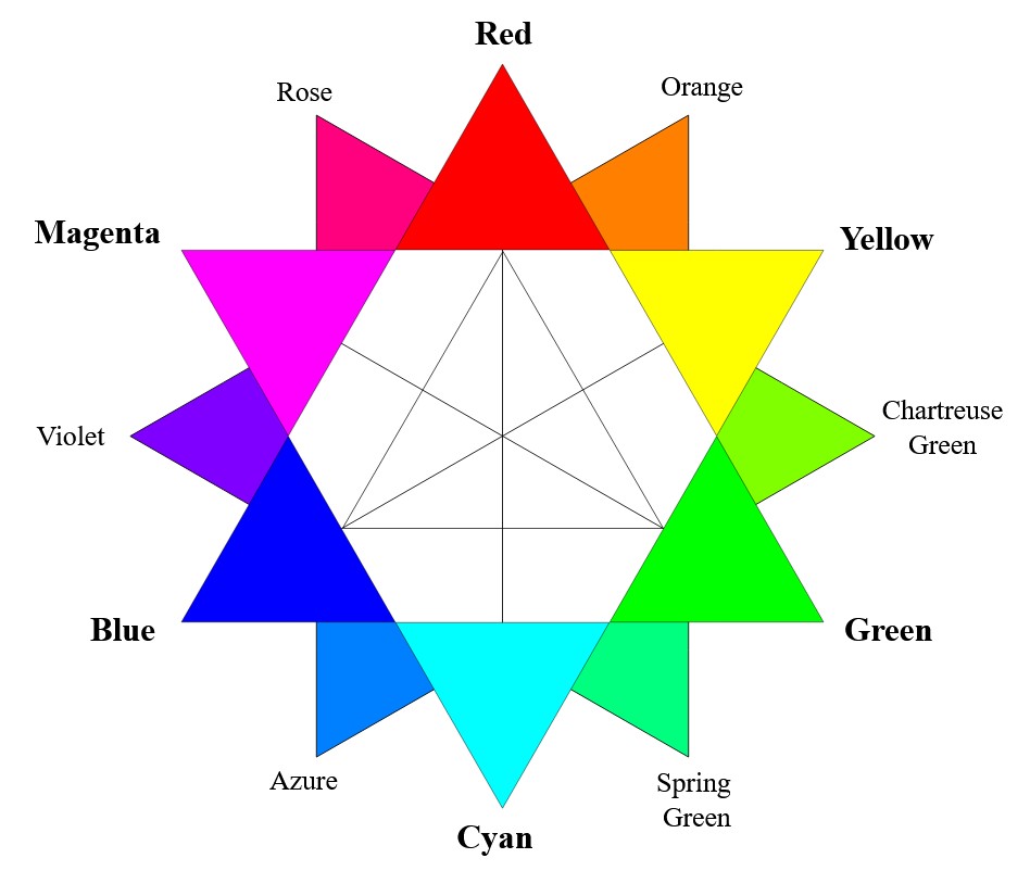
Colour Wheel
Most colour wheels in digital programmes are split into two parts:
- an outer wheel
- an inner element (could be a square, circle, triangle)
The outer part of the wheel contains the primary, secondary and tertiary colours but the inner part contains the saturation and value of those hues.
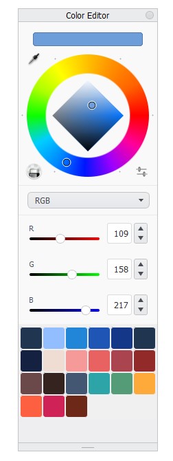
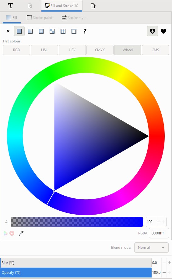
Screenshots of Sketchbook Pro and Inkscape, the latter to act as an illustrative comparator only.
Tip
In Sketchbook Pro when you open the colour editor, if you move the cursor along the relevant scale, you’ll see the cursor on the relevant part of the wheel move. It helps in the HSL setting to see the extremes in saturation and light.
RGB values
In Inkscape – you can have a numerical value attached to a colour, see the RGBA number at the bottom of the above image. F0r the blue on this website the number is 0044AA. In the various websites that generate a colour palette they will provide these values.
Sketchbook Pro does not do this which is on the face of it, annoying because I am so used to picking up colour as a set of letters and numbers. But the pipette function and getting into the habit of doing a palette on a page may well be the answer.
The start only
One suspects that understanding colour in digital art and how best to use it is going to be a long process and require more additions to this page or additional pages. For example, the impact of the different types of layers can affect the colour, the types of brushes and the variables of each brush is going to have an impact. I doubt it is going to be a linear learning path either! However, at least I can now look at the wheel and understand what some of the terms are now in order to experiment!
June 2022